Set up the component
In this doc you’ll learn how to manage the Framer Configurator component.
In this guide we'll dive in
Plugin
Customization.
Both parts are key to understand — if you want to sell in Framer, you’ll need to know how these two works.
Plugin
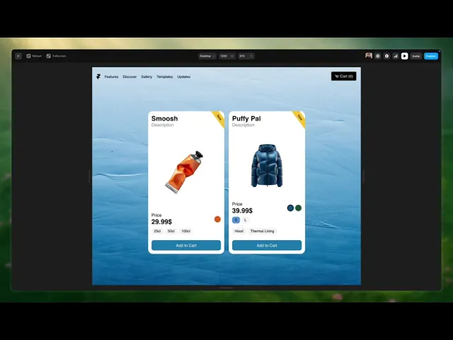
Framer Configurator manages your products so you don’t have to duplicate any product entries due to different color, size, or extra options. You can edit, change, or remove any attribute without duplicating the entry.
Depending on the plan you choose (basic/pro), you’ll have more or less control (and features).
Add Products
To add your products and their sizes and/or colors, follow the video below.
When adding the colors of your product, you must also indicate the sizes in which each color is available. The sizes must be written exactly the same. If I add an 'XL' size to the sizes panel, I should also type 'XL' in the available panel.
*If you do not want the edges of your product image to be visible, you must upload an image with the same background color as your card or without a background.
Add Extras
If you want to add an extra (Pro version only), follow the video below.
*extra means the quantity above the base price that we will charge to the customers who choose this option
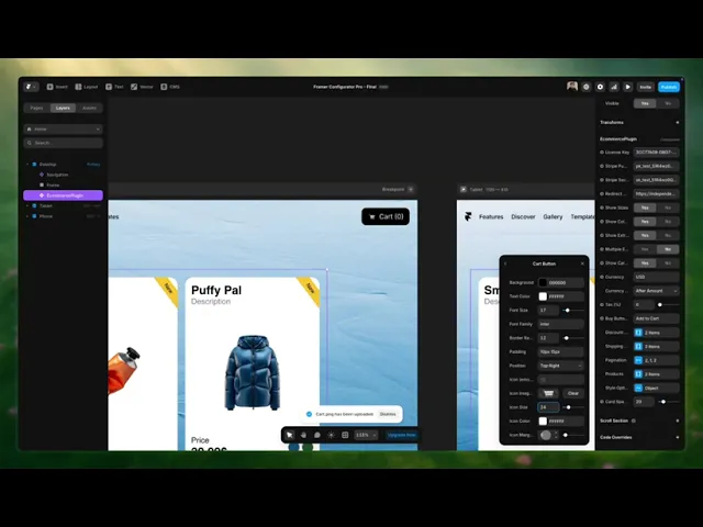
Cart Pop-up
The cart popup will allow our users to preview what they’ve added to their cart, with the option to proceed to the checkout page.
You can edit this pop-up (Pro only) by following the video below.
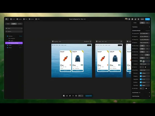
Currency
With Framer Configurator you can sell globally, in any currency and country.
To display prices in your preferred currency, follow the video below.
Taxes
Don’t worry about tax compliance — Framer Configurator helps you set this up. You’ll be able to choose the percentage (%) of the total price that should be taxed.

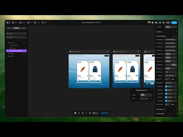
Shipping
Pro users can offer different shipping types, with any prices they want. To set this up follow the video below.
Customization
Intro to Customization
Framer Configurator pluign is built to be as customizable as possible.
Keep in mind that the pluign might not always render or work properly inside the Framer canvas or preview. Test everything in a real browser. Also, keep the plugin up to date. Go to the Assets panel, click the purple “Update” link next to the component.
Customization
Customization is 100% native. It works exactly like editing any other Framer element — There are no new systems to learn.
Customizable Elements
Explore the component and see which elements you can customize.
Elements: Main card | Cart | Buttons | Fonts & sizes | Label | Color icon | Cart Overlay
Depending on whether you have the Basic or Pro version, you’ll have more or fewer options:
Basic Version
You can adjust the size of the main product card. You can also choose the border color and whether to show the default shadows.

Cart
In this version, you can’t edit the cart appearance — only in the Pro version.
Buttons
Pick the button color and its hover color. This applies to the card button and the cart button.

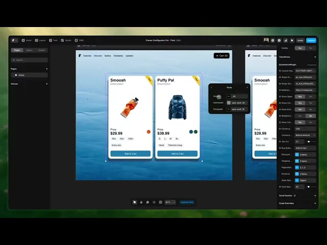
Fonts & Sizes
You can choose the font family but not the size — size editing is Pro only.
*The font you want to use will need to be written manually in the corresponding field, just as shown in the image above.
Label
Edit the label text shown at the top right of your card. Leave it empty if you don’t want it shown. More control? That’s possible with the Pro version.

Color Icon
The product icon colors come from the settings you define. There are two ways to set this:
Use a HEX code
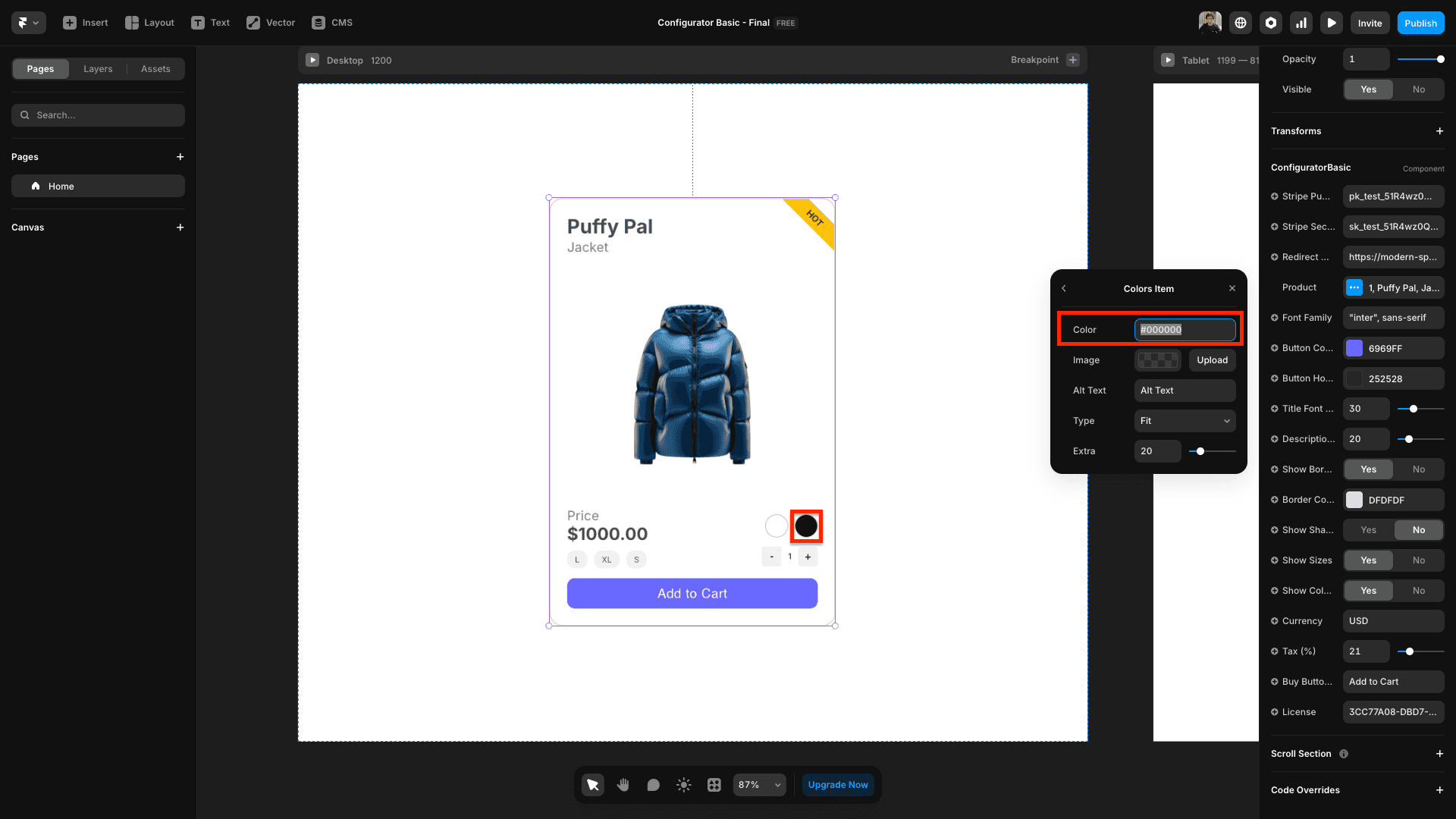
b. Write the color name
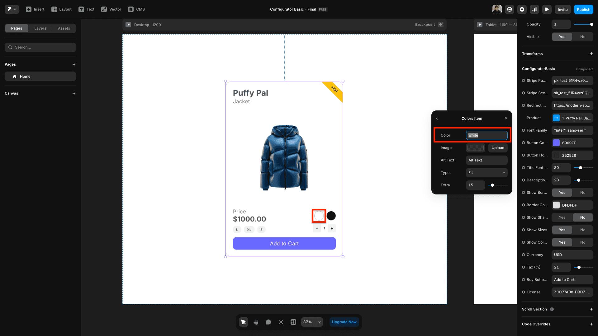
*If you need a specific shade of a color, we recommend using the HEX number, since we don’t support specific color names.
*With this version, you won’t be able to customize the icon to show your product image instead of a color. That’s only available in the Pro version.
Pro Version
You’ll be able to edit the color, shadows, icons, buttons, fonts of your product, and more. Basically, every element of the card.
Cart
You’ll be able to edit all the elements of the cart pop-up… colors, background, buttons, texts… almost everything you can imagine.
Buttons
You've the option to choose the color of both the primary and secondary button.

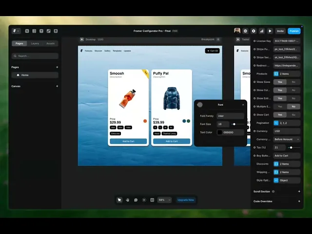
Fonts & Sizes
Choose independent font types and sizes for each text and/or title in your card and cart. Within each customizable element, you’ll find the option to edit the font, size, and color.
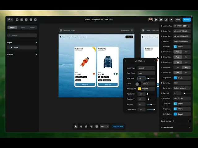
Label
Edit the text on your label. Choose the position, shape, text size, and colors so everything fits perfectly with your store.
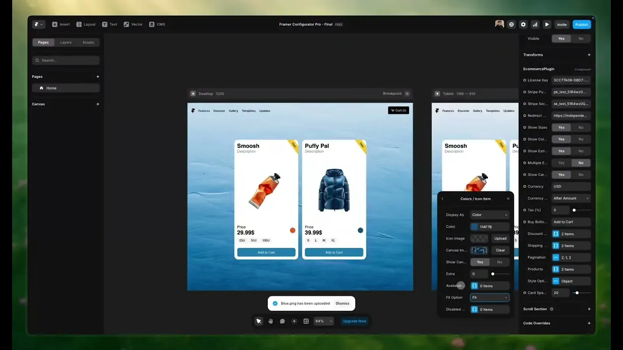
Color Icon
The colors of your product’s icons will be the ones you’ve defined in the settings.

*You've the option to add a unique image for the added color.
*With this version, you can customize the icon so your product image shows up instead of just a color.